11 design mistakes that can make your home look cheap
Make no mistake, we’re all guilty
Achieving a luxurious look is not necessarily a matter of price. There are myriad ways to add a touch of luxury to your home without breaking the bank or resorting to a complete overhaul. In fact, if you’re just in the mood for a refresh, taking a long, hard look at the layout and styling of your home can have huge consequences. That’s where an interior designer’s intuition and expertise can come in handy. While styling is often a matter of personal taste, if there’s one thing interior designers can teach us, it’s how to make the most of a space with a few simple tricks. From correct rug placement to appropriate wall hangings and lighting choices, often it’s the minutiae that make a room.
But what happens when you flip the script and take a look at the things that might be detracting from your home? Call them mistakes, errors in judgment, or mere blind spots, we can sometimes make design choices that don’t work in our home’s favor. Thankfully, that’s where an interior designer can really help. Below, we’ve spoken to three interior designers about some of these commonplace design and styling errors and the best ways to fix them, or better yet, avoid them altogether.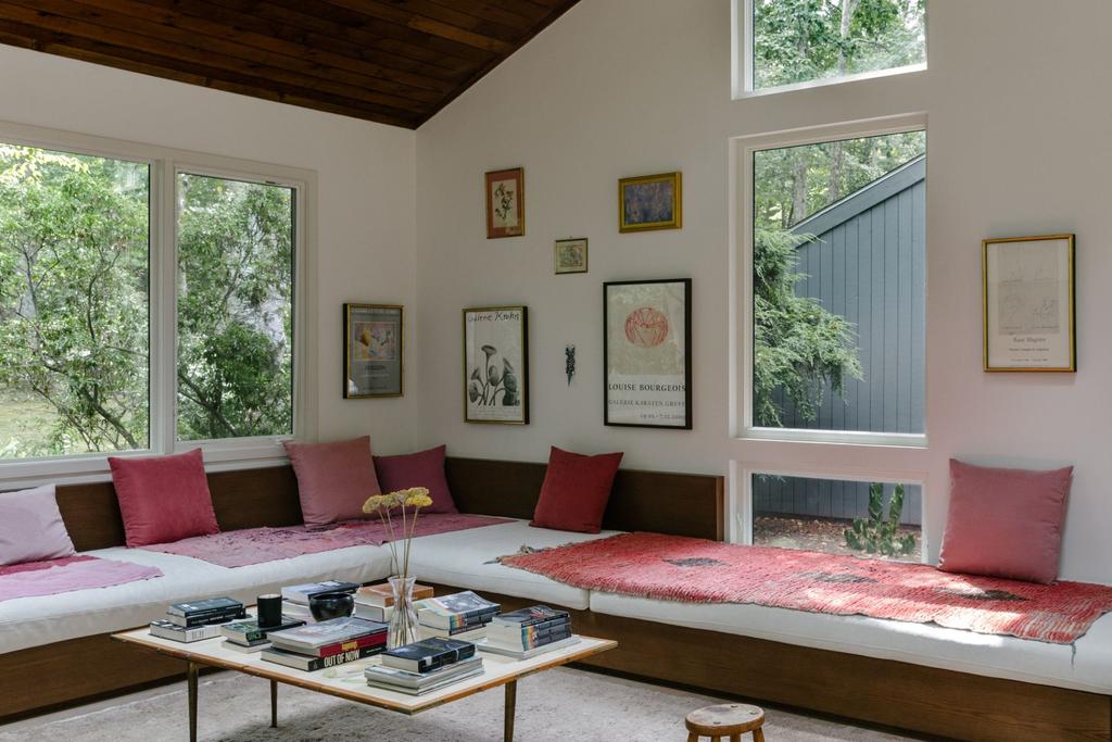
Image Credit: Nick Glimenakis
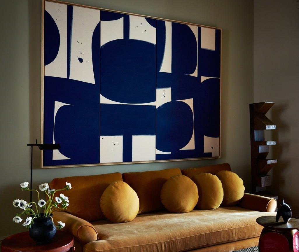
1. Boring furniture placement
“Depending on the space, I think a uniform look and limited furniture options can make a space feel too conventional,” says New York-based interior designer Jae Joo of Jae Joo Designs. “I like to maximize comfort and function when it comes to arranging furniture and try to think outside the traditional placements that we’re used to seeing. For example, built-in sofas or benches along the walls can transform the proportions of the living room to become more distinctive and unique instead of a traditional set up of a sofa, chairs, and a coffee table.” It’s certainly a design that makes a statement in the designer’s Connecticut country home.
Image Credit: Nick Glimenakis
2. Being too matchy-matchy
“Unusual placement of pieces can make your home feel charming and inviting,” says Joo. “Instead of matching nightstands, you can swap one out to put a [small] desk next to the bed, which is one of my favorite setups to elevate the look of a guest bedroom.” She’s also partial to thinking outside the box in terms of an item’s functionality. Don’t be afraid to use furniture in new ways. “I think an antique dresser can be anything it wants—a console, a credenza, or a side table,” says Joo.
Image Credit: Tim Lenz
3. Poor rug placement
Designers love to harp on about this-for good reason. “A rug should ground a room,” says interior designer Crystal Sinclair. “Furniture should sit on the rug, not around it. I always go wider than the sofa when selecting a rug, and in the bedroom, try to select a rug that’s as wide or wider than the bed with nightstands combined, and positioned slightly in front of the nightstands, not under them.”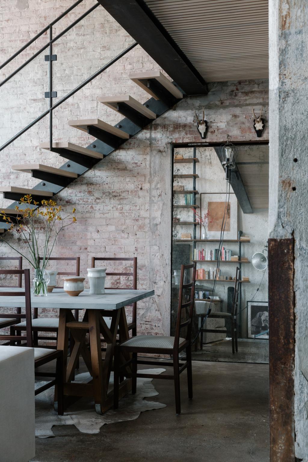
Image Credit: Nick Glimenakis
4. Choosing new over vintage
“I frequently find that new rugs imitating old world patterns can often cheapen the look of the space,” Joo says. “I like to use antique rugs unless I’m searching for specific patterns or colors.” Granted, not everyone may have access to a vintage rug, but Joo stresses that they don’t need to be in perfect shape. “Investing in a vintage rug is one of the best ways to elevate your space,” she adds. “You can choose from a wide range of vintage rugs, even the ones that are not in perfect condition. I love the faded colors and the quirky-shaped ones too; they make the space feel eccentric.” For Joo, a rug is an essential statement piece in any home, so it pays to spend time sourcing the right one. “You could have your furniture all white and simple, and with a great rug, it could feel perfectly balanced and serene.”
Image Credit: Sean Litchfield
5. One note arrangements
The best styled homes often have a mixture of decorative and sentimental items and personal knick-knacks; store-bought everything makes a home feel one-dimensional. Adding a mixture of vintage, unique, and trend-based pieces to your living spaces will ensure your home doesn’t have that cookie-cutter feel. And the best way to style them? “Layer, layer, layer!” says Sinclair. “People often spread everything out-think about how you can layer them. Maybe place the larger item in the back with something smaller in front of it.”
Image Credit: Nick Glimenakis
6. The wrong tapware
“I like to use unlacquered brass that patinas and ages with time,” says Joo. Think of how your tapware will look with the rest of your decor, and consider how you want it to age. “I find that polished brass fixtures tend to look harsh with organic surfaces like stone or plaster. Adding unlacquered brass fixtures is a great quick upgrade to the kitchen; even with simple cabinetry, it can warm up the space and give it a whole new look.”
Image Credit: Seth Caplan
7. (Way) harsh lighting
Ask any actor, photographer, or model, and they’ll say the same thing: lighting is everything. “No one looks good in harsh overhead lighting—I would live by candlelight if I could,” says interior designer Benjamin Vandiver. “Since that doesn’t always work, adding a table or floor lamp in any room at different heights will do wonders. Dimmer cords are your best friend, too,” he says.
Crystal Sinclair agrees. “When thinking about lighting, think about layering it,” she says. “It shouldn’t all be just overhead lighting—it’s not always the answer. I say in a relaxed setting, overhead lighting should be turned off and lamps turned on for the best ambiance effect. Think about table lamps, floor lamps, and even plug-in wall sconces.”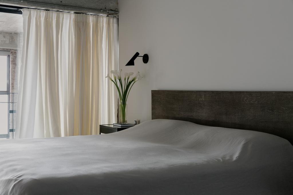
Image Credit: Nick Glimenakis
8. Lighting that’s not flattering
And pay attention to the kind of light, too. “Always go for the warm lighting versus daylight brightness,” suggests Joo. “Harsh lights can make the space feel sterile; warm lights add a nice glow and depth to the room, which makes it feel more welcoming and serene.”
“I’m also a big fan of collecting vintage candle sticks and adding simple taper candles to surfaces like coffee tables,” says Vandiver. “Dimming lamps and [lighting] a few taper candles at night feels like a luxury to me-I always keep Cire Trudon taper candles on hand, especially when company is coming over.”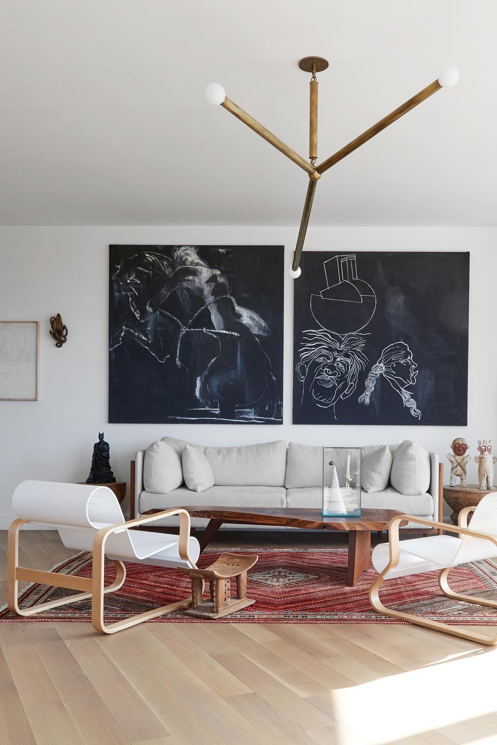
Image Credit: Reid Rolls
9. Badly hung art
“One of the most common mistakes I see is the arrangement and installation of art-luckily, it’s also simple to correct,” says Vandiver. “Too often, I see art hung entirely too high- I always err on the lower side. When installing art, I like to see something in two dimensions on my phone before using the hammer. Take a photo of the art while standing and sitting in the room. Don’t be afraid to hang things very low, especially near accent chairs.”
And lastly, don’t skimp on the finished product, says Sinclair. “Be careful what frame and glass you opt for with a print. A poorly constructed frame will cheapen whatever you put inside.”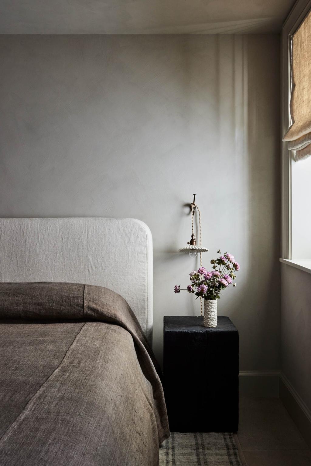
Image Credit: Nicole Franzen
10. The wrong vessels
What’s the fastest way to ruin a perfectly good bouquet of flowers? “No matter how beautiful fresh flowers are, 90 percent of the time they’re living in terrible, cheap clear glass vases,” says Vandiver. “I love living with fresh flowers—it’s the easiest way to add a simple luxury. I believe the vessel should be at least as interesting as the flowers themselves.” He’s not a fan of glass vases in general and insists on being creative with your approach. “Try starting with a small collection of interesting French ceramics (you can find them online). Think outside of the box: an old mossy terracotta container with a liner inside sounds chic to me.”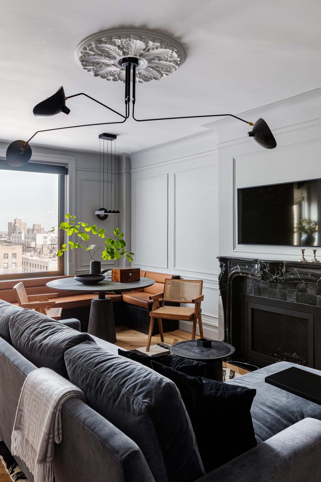
Image Credit: Sean Litchfield
11. Colour overload
While a pop of color can do wonders for adding spark and personality to a room, be wary of going overboard. “Unless you’re going for a neon color internationally, be careful when selecting color,” says Sinclair. “A little splash of color goes a long way!” All the more reason to consider paint swatches and their undertones very carefully. “It may look almost gray, but when painted on all four walls (and possibly the ceiling), the color will come out,” she cautions.
Source: www.vogue.com.au